The business & the brief.
Morrow Studio is the fictional practice of photographer Wren Morrow, who shoots commercial, fashion, editorial and wedding work from Brooklyn and travels for it. The site exists to make art buyers, editors and couples open a project and look, then commission through a minimal inquiry form.
Morrow Studio is a fictional business. This concept was designed and built by Obsidian Webworks to demonstrate what we create for experimental creative portfolio businesses. No client results are implied.
Look, feel & voice.
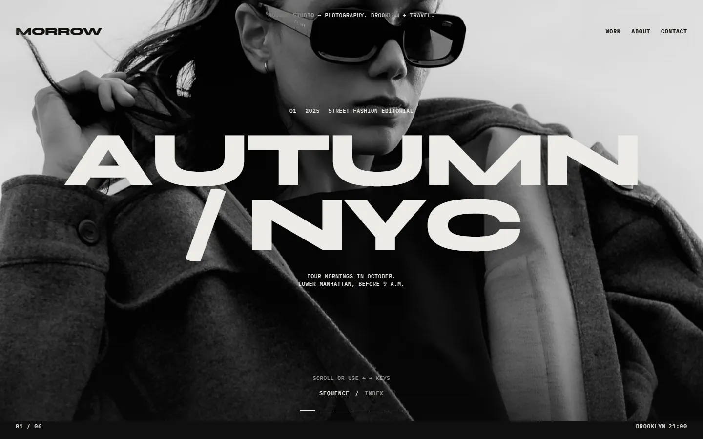
Experimental gallery portfolio: just two colours, bone and near-black, inverting from page to page, with Syne set so large the titles become shapes and IBM Plex Mono for every label, like wall text. There are no filled buttons, cards or accent colour, so the photographs carry all the colour.
Built to bring customers in.
Full-screen sequence
The home page steps through six projects with a direction-aware clip wipe, driven by throttled wheel, arrow keys, swipe and a clickable progress bar, then releases scroll to the footer after the last slide.
Four-corner frame
Wordmark, nav, a live project index (03 / 06) and a live Brooklyn clock sit in the corners in difference blend mode, so they stay legible over any photograph.
Cursor-following label
On desktop an eased label follows the pointer over the sequence, reading “View project” or “Coming soon”, and a click anywhere opens the current project.
Index view with floating previews
A toggle swaps the sequence for a typographic list (title · category · year), where hovering a title shows a preview image that trails the cursor; on mobile each row carries its own thumbnail.
Book-like project sequences
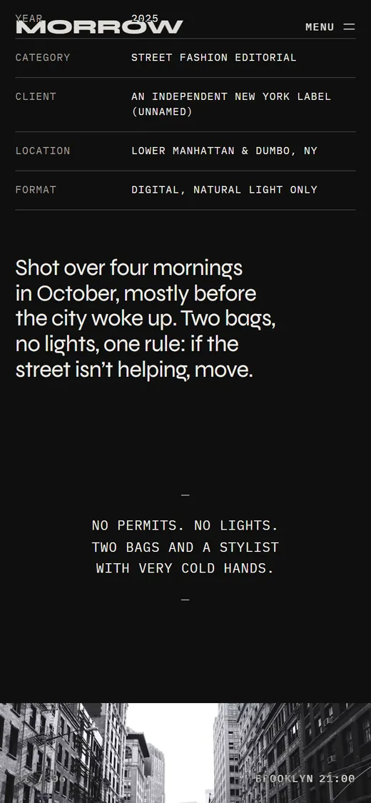
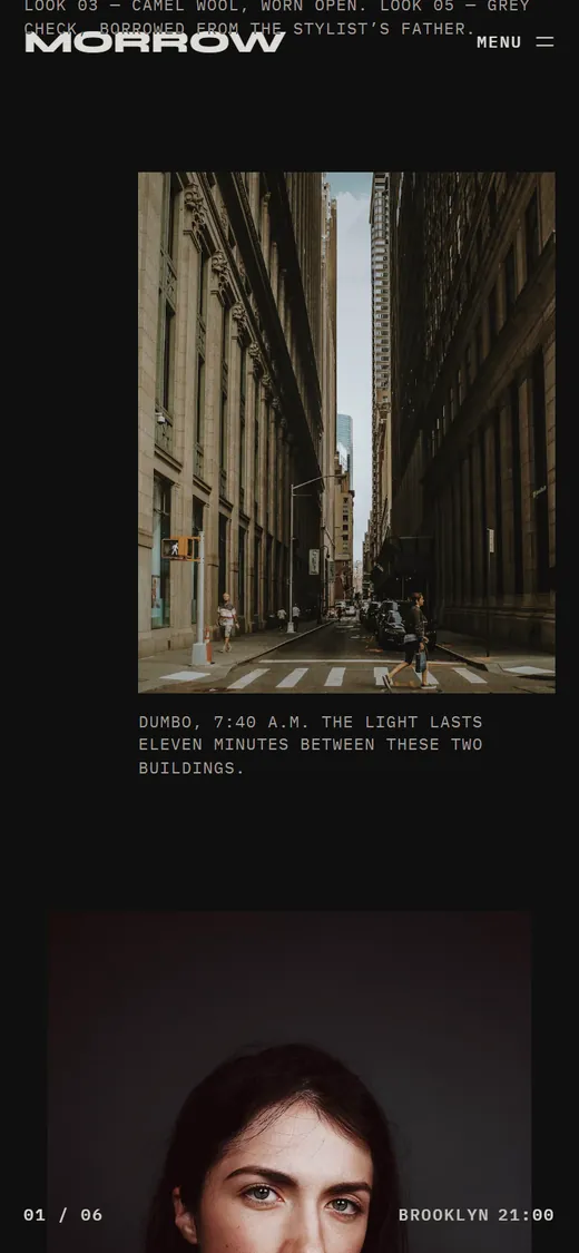
Each project page moves from a full-screen opener through full-bleed, two-up, offset, centred-portrait and staggered layouts with mono captions, then notes, credits and a next-project panel that scales with scroll.
Split-letter titles and curtain transitions
Giant Syne titles rise letter by letter, and internal links lower an ink curtain that lifts on the next page, with all of it falling back to simple fades under reduced motion.
Typographic commission form
Underline inputs, square-tick type selector, inline validation messages in the brand voice and a designed “Received.” state, all client-side.
Pages that change the room
Autumn / NYC and Atelier Noor hang on near-black walls, while Salt & Linen, About and Work are bone, so moving between projects feels like walking between rooms.
The full experience.
Hover (or tap) to scroll the entire homepage. Every section, top to bottom.

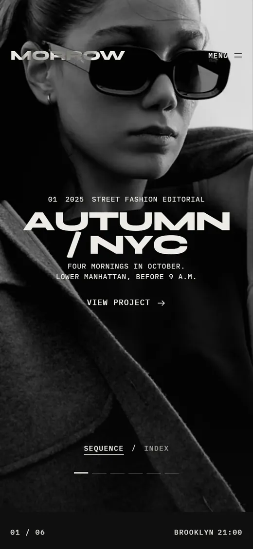
Designed for the phone first.
Most customers will meet this brand on a phone. The mobile layout is designed on its own terms, with thumb-friendly actions and a dedicated menu.
Site sections.
A complete, production-ready structure. Every section is designed, written and responsive.
- Full-screen project sequence
- Index view
- Project opener
- Image sequence
- Notes & credits
- Next project
- About & approach
- Areas of work
- Process
- Rates from
- Commission form
Want a website like this for your business?
Tell us what you do and who you serve. We’ll show you what your website could be.
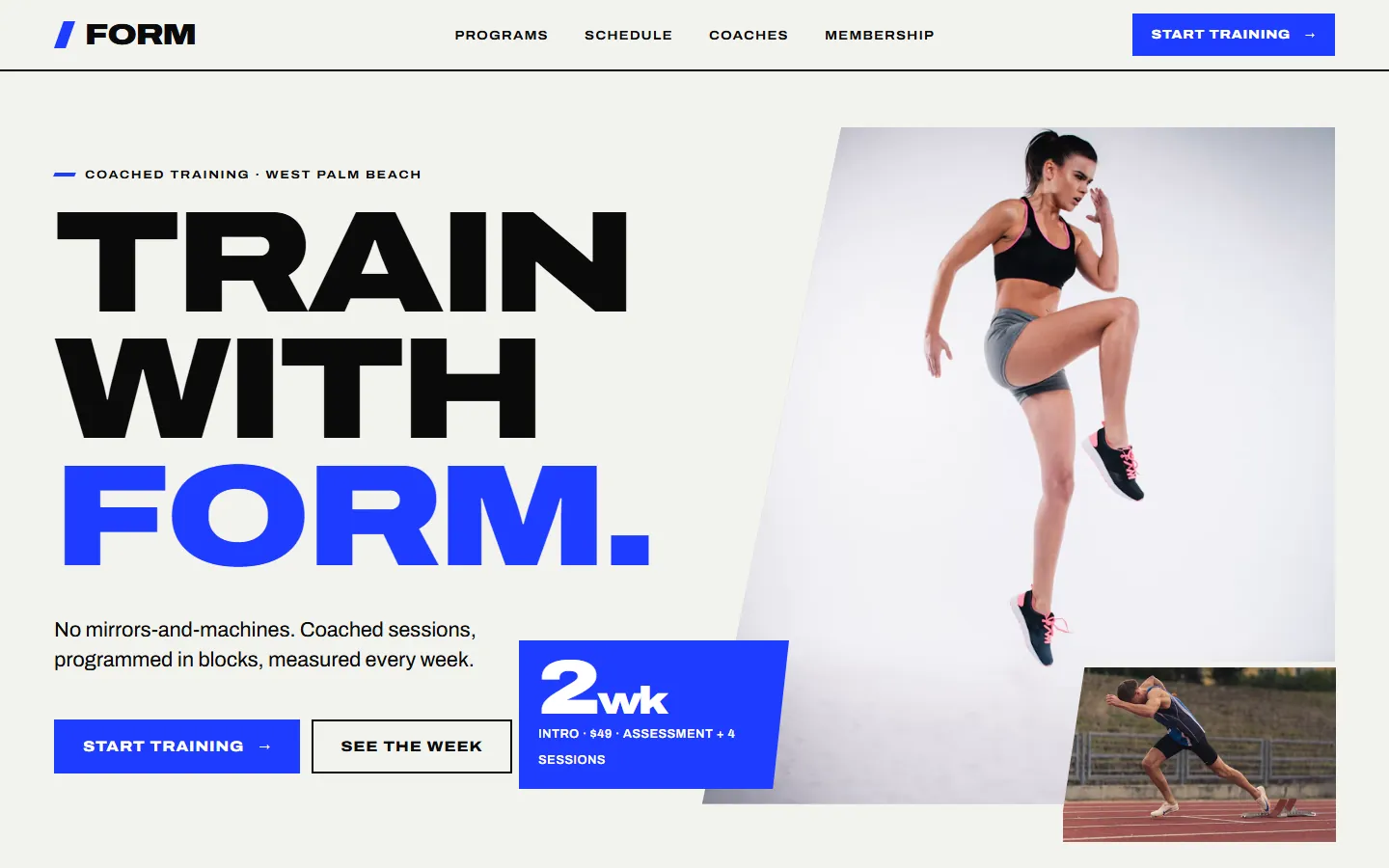
Start Your ProjectForm Athletics
Personal Training & Small-Group Performance Studio
Explore Project